Step 1. Find the Purpose of Your Blog Homepage
To create a powerful homepage for your travel blog, you need to define your main objective that will further guide the whole design process. Here are three examples of goals that bloggers strive to reach via their homepage:
- Increase conversions. If you want your website visitors to convert, you need to motivate them enough and reduce friction. To do so, be sure to place the forms you want visitors to fill out or buttons to click in a prominent location. This includes registration, subscription, and feedback forms.
- Present your brand. For visitors coming to your blog for the first time, it’s important that they can clearly understand what it is that you do. A homepage can help you make a strong first impression. You can present your brand’s principles, value proposition, and mission.
- Improve user experience. Users normally come to a website with a purpose in mind, such as searching for information, exploring services, subscribing to a newsletter, etc. Good design will help visitors to your travel blog navigate your site and determine what they need.
Step 2. Pick the Right Design Elements
Now that you know the main goals that a homepage can help you achieve, ask yourself the following questions: What do you absolutely need on the page? What does your target audience expect to find there? What design elements are a priority? Answers to these questions will help you design the homepage structure for your travel blog.
Meanwhile, here are some of the essential elements that should go into each and every blog homepage.
1. Clear Value Proposition
Visitors to your website should immediately understand what your brand offers. So, tell them exactly what it is that you do with a clear value proposition. Otherwise, they won’t be likely to stick around for much longer.
Research has shown that, on average, visitors check out a new website for 10 to 20 seconds on average. However, pages with a clear value proposition can hold their attention for longer.
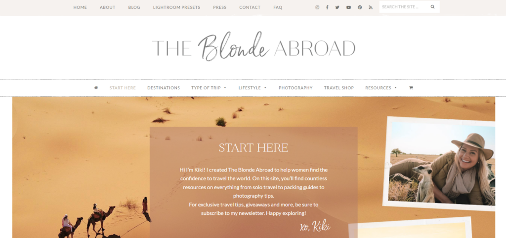
For example, the homepage of The Blonde Abroad features a welcome text that introduces the blog and appeals to the target audience of female travelers.
2. A Call to Action
When you understand what you want your visitors to do, you can accelerate action through a visible call to action (CTA). The most effective CTAs make use of buttons and/or links that contrast with the color of the background. For example, if you want more users to join your email list, add a “Subscribe” button.
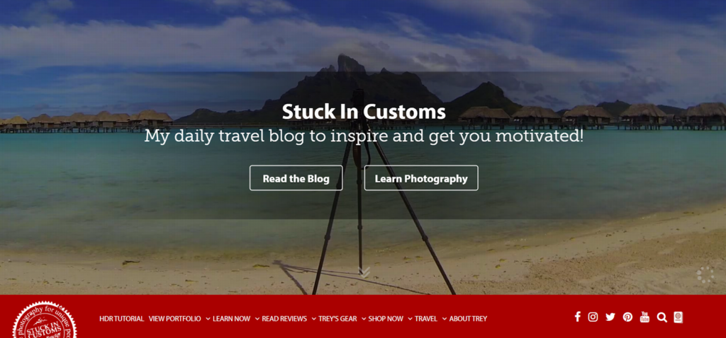
You can use several CTAs if you want to send visitors to different pages of your site. For example, the Stuck In Customs blog homepage invites users to “Read the Blog” and “Learn Photography”.
3. Your Best Content
Include your absolute best posts on your homepage so you’ll have higher chances of holding the attention of your audience for longer. Good content will encourage users to keep exploring your posts and help build trust. It can also be a great way to move leads through the marketing funnel.
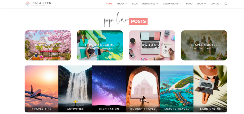
For example, the I Am Aileen blog homepage features the most popular posts so readers can check out the best content right away.
4. Your Latest Posts
To accommodate your regular visitors, you could display your most recent posts on your blog homepage. This will also let new users know that your website is constantly being updated and contains relevant information.
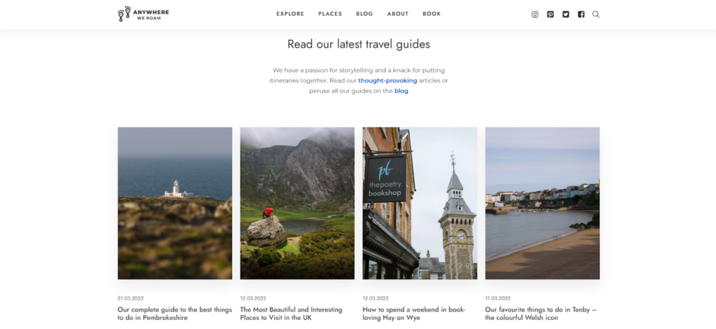
In the example below, you can see the latest travel guides of the Anywhere We Roam blog.
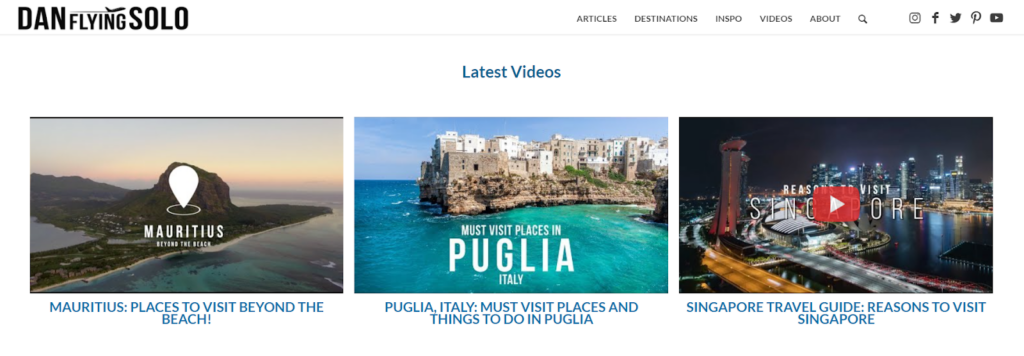
If you post other forms of content, you can share them as well. For instance, the Dan Flying Solo blog homepage features the latest videos.
5. Social Proof
An overwhelming part (84%) of consumers find online reviews to be “important or very important” in their shopping decisions. So, sharing positive feedback from customers can greatly help to build trust with your audience. You can create a section for reviews on your website or simply screenshot positive comments and display them in a gallery. Adding a name and photo gives far more credibility to testimonials.
Another way to leverage social proof is to add a “featured on” list with a number of platforms that have links back to your website. Adding a link to publications will establish further trust.
6. Information About You
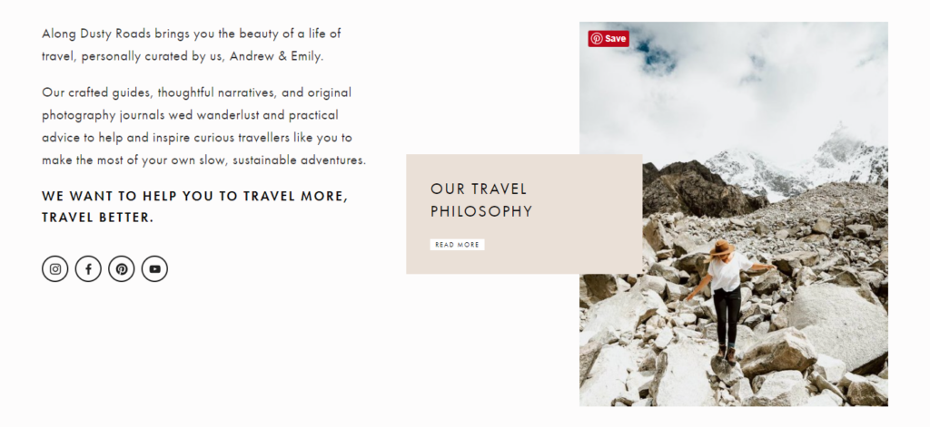
Write a bit about yourself, including your qualifications and experience so users can relate to you and take an interest in your writing. Adding your photo will add a humanizing touch to your website and increase your credibility. For example, if you scroll down the homepage of the Along The Dusty Roads blog, you’ll find a quick note from its creators about what the blog offers. It’s concise, yet descriptive, and features the blog’s mission.
7. Social Media Buttons
Place social media buttons on the homepage so that users can follow you on those platforms. This will allow them to learn all the news from your brand even if they don’t specifically check your website. For instance, you can put social buttons in the header, footer, or sidebar.
8. Email Subscription Form
If your value proposition and homepage are captivating enough, visitors may want to subscribe to your newsletter to receive updates from your blog directly in their mailbox. Make sure to place a subscription form on your homepage if you wish to grow your mailing list.
For example, the Indie Traveler blog has a noteworthy subscription form with only two fields to fill in. In addition, there is a clear description of the newsletter content that is clearly visible on the page.

9. Contact Information
Putting your contact information on your website will allow users to reach you when needed. Many companies place their email address, phone number, and legal address in the footer of their website. Thus, you won’t lose any potential leads and can add credibility to your brand.
Step 3. Follow the Best Practices
To create a thoughtful homepage design for your travel blog, you’ll need to establish a hierarchy among the elements on your page. Thus, visitors will travel from one element to another until they reach your CTA and complete the required action. Here are a few ideas on how to make efficient travel blog templates.
1. Grab Attention With Your Headline
A clever headline will present your offer to visitors so they immediately know they’re in the right place. With just a few words, you can make your headline captivating. Visitors might be hard-pressed to find detailed information about your brand’s specifics, but a clear headline (usually placed next to the logo or at the top of the page) will let them know right away.
2. Design Simple
Simple travel blog design is advantageous because it focuses the audience’s attention on what’s important and facilitates site navigation. 76% of visitors believe that easy navigation is the most important factor in website design. So, start with the basics and include only crucial elements in your design.
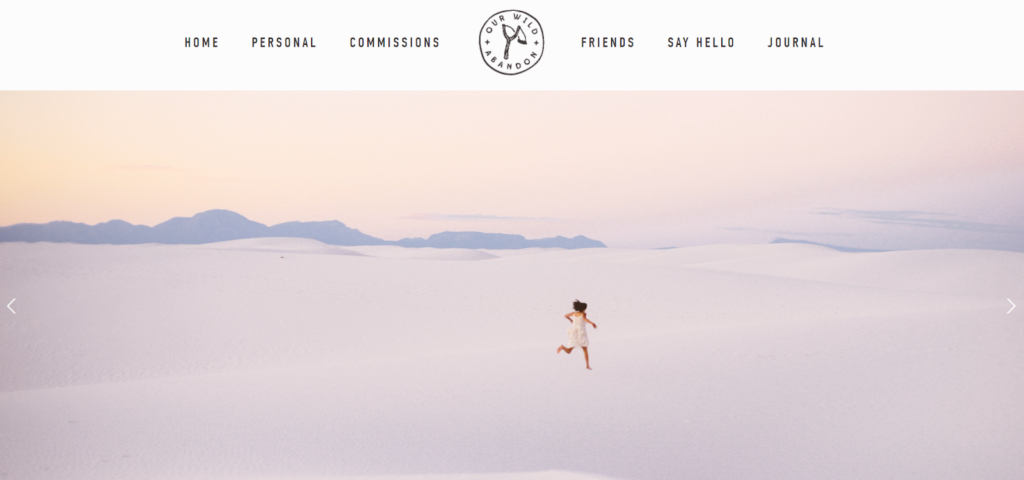
Look at this simple, yet eye-catching design of Our Wild Abandon travel blog. Sometimes less is more, isn’t it?
Also, keep mobile users in mind. As more and more traffic is coming from mobile devices, making your website mobile-responsive will ensure a smooth experience for smartphone users. For this reason, it’s better to build your website with mobile in mind instead of fixing the layout later on.
3. Add a CTA
Depending on what your homepage aims to compel your visitors to do, create appropriate CTAs that help move leads down the funnel. You can even add two or three CTAs in different places on the page. For example, add a “Subscribe” button for the newsletter, a “Learn More” button to direct users to your offer, or a “Book” button to send users to the booking page.
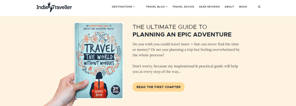
Below is an example of a CTA button on the Indie Traveller blog, inviting the user to read the blogger’s eBook. The button has a more intense color than the background, so it’s clearly visible and distinctly presents the offer by stating “Read the First Chapter”.
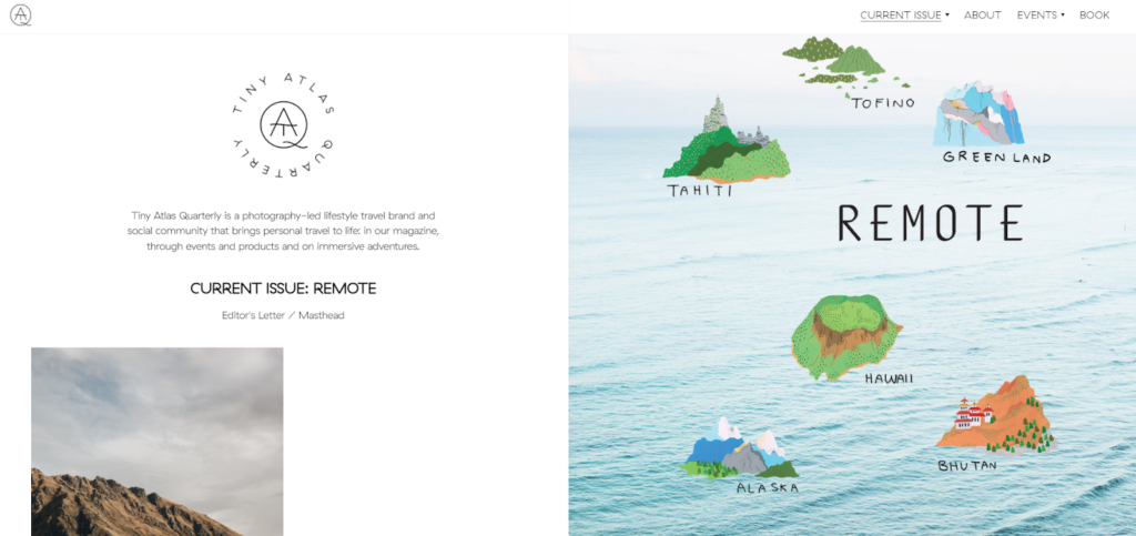
4. Place Your Offer Above the Fold
When you describe your value proposition, make sure to place it all above the fold. Thus, prospects will see what it is that you offer even if they don’t intend to scroll down (which some may not). Compelling the target audience to stick around with your headline and offer may significantly improve your blog’s performance.
On the example below, you can read about the Tiny Atlas blog’s focus right as you open the homepage, so you can determine whether or not you want to stay.
5. Show Content Categories
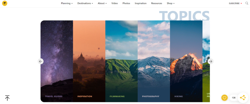
To facilitate navigation, you can offer a selection of categories for users to choose from so they can discover the most relevant posts themselves, as in the below example of the BucketListly Blog.
How to Create a Travel Blog Homepage
When new visitors come to your website, they are usually eager to find the information they are looking for. The faster they can do this, the better. For this reason, you should create a homepage design for your travel blog that will allow users to easily navigate the site and find answers to their questions. For better results, be sure to offer a clear value proposition, introduce your best content, and move users forward with the right CTA.


